Out of kilter: confusing times for translators

One of my first ever posts, “Translators’ time-warp“, was about the confusion that arises when you work with clients in different time zones and with different public holidays from your own.

Well, it’s happening again today. It’s bad enough getting back into work mode after the Christmas and New Year period (although to be honest I’ll be glad to get back to normal. And so will my waistline). But here in Scotland we’re out of kilter today not just with Europe and the rest of the world but with the rest of the UK too. That’s because 2 January is a Scottish bank holiday – no doubt the powers that be decided there was no point opening for business when most of the staff would still be nursing their Hogmanay (31 December) and Ne’erday (1 January) hangovers.

So, I’m working on my first projects of 2014 and today am “on call” for an Italian client, while the rest of the country is still on holiday. Then Monday 6 January will be a public holiday in Italy (the Epiphany or, in its modern incarnation, the “Befana“), but not here. What’s a translator to do?

Official public holidays in the UK.

Official public holidays in Italy.

Other posts you might like:

Grapes, lentils, black bun and first foots

For a clear New Year: a musical style guide from the EU Commission

By Marian Dougan


To the email manners born. Not.

Quality markDo you ever get annoyed with your clients’ manners? I often do, for example when they don’t acknowledge, far less thank me for, a translation I’ve delivered by email. If I were to walk into the client’s office and hand over the translation in paper format, I’m sure they’d say “Thanks”. So what happens to their manners when the translation arrives via their inbox?

As it turns out, dodgy email manners aren’t all on the clients’ side. I’ve contacted fellow translators, several of them ITI members, a couple of times in the last few months to ask for a quote for a project I was coordinating. Over the same period, a non-translator friend of mine, Laura, also contacted a number of translators and agencies/companies for a project involving non-European languages. She shared the results with me.

Our email request

First, here’s an amalgam of the messages we sent:

Dear xxx,

I’d be grateful if you could send me a quote for a translation from English to Italian of the attached will. The translation is needed by lunchtime, Friday 8 November. I’m not sure right now but I may require a certified translation. Could you let me know if that would involve an additional charge, and if so, how much? By the way, I found your name in the ITI Directory.

I’d appreciate it if you could reply by return and in the meantime I look forward to hearing from you.

Many thanks and best regards,

Maura

[followed by email signature with full name, contact info and company  details]

Most of the replies were absolutely fine: courteous and providing all of the relevant pricing and timing information. But three took my breath away, and not in a good way. Here they are, exactly as we received them (but with the names/initials changed):

Translators’ replies

Reply no. 1:

Hello

Who are you? What is the name and address of the company?

Regards

[followed by email signature with full contact details]

Reply no. 2:

Unfortunately have no availability at the moment. TOD

[TOD = translator’s initials. No name or other contact details provided]

Reply no. 3:

Sorry, not possible. Regards. Fred bloggs

Sent from my iPhone

[Fred bloggs wasn’t the translator’s real name, obviously, but the name was written just like that: lower case surname. No other contact details provided]

What do you think, bearing in mind that these replies are to potential new clients? Potential new directclients, in at least one case? Potential new clients who might be sending you a lot of work in the future? Let us know in the comments.

PS I’ve put the “Q” quality mark to this post, although it’s mainly about poor quality. To my mind, anyway. Maybe I should ask Zoë to design a “Q” with a whopping great “X” through it.

Other posts you might like:

From GIGO to QIQO: The quest for quality

How to be good (1) Tips for translators

How to be good (2): Tips for clients

By Marian Dougan

Who’s not happy with “selfie” as Word of the Year?

What do you think of the Oxford English Dictionary’s choice of “selfie” as Word of the Year for 2013?

I’m not mad about the word itself, although that’s probably an age/generational thing. In my young day (indeed, in most people’s young day) the technology for selfies wasn’t available: you took a photo of yourself, alone or with our friends, in a photo booth. And that was that. You couldn’t post the photo online or publicise it.

TARDIS onesieWe should be grateful, I suppose, for small mercies: they could have chosen “onesie”. Or, even worse, “selfie-in-a-onesie”.

Here’s my choice of word of the year, in honour of 50 years of Dr. Who: TARDIS (Time and Relative Dimension in Space), used as a term to describe a building that looks small on the outside but is, or looks, much bigger once you’re inside. Again, this might be a generational thing: I was a big Dr Who fan during the 1960s (and  had nightmares about the Daleks). So now it comes naturally to me to use TARDIS in that way.

Maggie's Centre, Western Infirmary, Glasgow

One TARDIS-like building that comes to mind is the Maggie’s Centre at Glasgow’s Western Infirmary, by Page/Park architects. Quite an amazing building, I think.

What do you think of the OED’s choice of “selfie”? What would you have chosen?

PS: If you really want to know, the TARDIS onesie is available from RED5.

Other posts you might like:

English words the world likes…

…and words you just can’t abide

Hard times bring new words

By Marian Dougan

Getting credit for our website translations: A good thing, surely. Or maybe not?

Twitter can be a great source of inspiration for blog posts.

I spent some time this afternoon looking at Italian websites for a project I was working on and found only one that included the translators’ names among the credits. Indeed, with most Italian sites if you click the “Credits” link in the footer you’re whisked straight to the web developer’s site. No-one else gets a mention.

Annoyed, I tweeted indignantly about this lack of credit and recognition for translators. But other translators on Twitter were quick to point out that having your name on a website translation isn’t necessarily a good thing. First, because the translations are sometimes the work of more than one translator, so you could be viewed as responsible for someone else’s mistakes (as they could be for yours – not that I, or the readers of this blog, ever make mistakes…). And second, because, as Isabel Hurtado de Mendoza pointed out, “Too many people (non-linguists included) tamper with website text”. Which makes it potentially risky to put your name to your translation.

Chris Durban* recommends that translators should “sign” their translations as standard practice: we should be proud to put our names to our work. But that’s easier to do with printed publications than it is for the web, which is fluid and ever-changing, and more open to interference than print is.

It’s a pity, isn’t it, and a missed marketing opportunity. I sometimes include a link in my marketing material to a specific web-page (an article or speech, say) that I’ve translated (having first checked that no-one’s messed it up).

What about you, readers? Have any of you found a way to prevent people tampering with your web translations?

With thanks to @cbavington @petergarner @PippaSandford @Lingotrans and @pbtranslations (hope I didn’t miss anyone out!).

Up-date: Chris has pointed out in the comments that she does not advocate signing website translations: the risk of interference is too high.

By Marian Dougan


The Gettysburg Address: lessons for writers (and translators!)

Today is the 150th anniversary of the Gettysburg address, delivered by Abraham Lincoln on 19 November 1863. Cordelia (aka Dilly or Dill) Ditton, a Glasgow-based actress, director and communication coach, wrote an interesting blog post about the Address back in February, entitled “Abraham Lincoln, the power of sound and maybe the greatest speech ever written“. Dilly’s post contains some good advice on writing (and translating, which is, after all, a form of writing): the power of the sound of the words, the importance of listening to what you’re writing.

Dilly also mentions another important element of good writing: brevity. Here she compares the speech given by Edward Everett, the “keynote speaker” at Gettysburg, and that given by Lincoln:

Edward Everett spoke for 2 hours, as was the custom at the time.  No-one remembers his speech.  Lincoln spoke for 2 minutes, his speech consisted of just 10 sentences and holds some of the most famous phrases in the English Language.

In speech-making, more is not necessarily more.

Other posts you might like:

The king’s speech (not to mention the queen and the presidents’)

The king’s speech — and how to translate it

When the Poet Died: on translating remembrance

By Marian Dougan


All about price? Not necessarily

Qb - Quality markSmall-business owners and freelancers talk, and worry, a lot about pricing: how to charge a decent rate without frightening potential clients away. Price is certainly  important, but it’s not the only factor motivating clients.

I had confirmation of this recently from a new client. An Italian company had contacted me  for an urgent translation of documents they needed to submit for a tender in the US. When I’d delivered the translation I asked my contact in the company, Antonella, how they’d found me. She replied that they’d done some internet research and had found my website to be clear and professional looking. She got the impression the site had been written and produced by “people who know what they’re doing”. Antonella had contacted other translators/agencies too, but I was the only one who replied promptly and came over in my emails as helpful and competent, and with a good customer-relations manner (her words, not mine).

So: clients don’t just judge us on price. Our professionalism, or the lack of it, comes over in all sorts of ways: in our internet presence (and that includes Twitter and the other social media!) and the way we communicate with clients. Each and every phone call, letter, email, quote or invoice counts.

PS The “Q” at the top of this post is my “quality mark”, which I’ll be using (when I remember!) for posts focusing on quality and professionalism.

By Marian Dougan

More about fonts: Helvetica 1, Arial 0

If you’re interested in fonts, and especially if you don’t like Arial but do like having your prejudices confirmed, you might enjoy a couple of articles written by typeface designer Mark Simonson. He describes Arial as:

actually rather homely. Not that homeliness is necessarily a bad thing for a typeface. With typefaces, character and history are just as important. Arial, however, has a rather dubious history and not much character. In fact, Arial is little more than a shameless impostor.

Here’s the full post: The Scourge of Arial.

In another post, How to Spot Arial, Mark compares Arial, Helvetica and Grotesque. Both posts were written in 2001, so before the film Helvetica was made. Indeed, thanks to that film his closing hypothesis

I can almost hear young designers now saying, “Helvetica? That’s that font that looks kinda like Arial, right?”

is now a bit less likely.

By Marian Dougan

Workable fonts, and a tip for proofreading

Do you have a favourite font for on-screen work? Or do certain fonts hurt your eyes the minute you open the file?

I’ve been working on a short translation project consisting of two interview transcripts of about 600 words each. Both of the source texts were in Arial 12-point, justified, without a single paragraph break. It made me feel dizzy just to look at them. The first thing I did, before even thinking about paragraph breaks, was to change them to Verdana, my preferred font for on-screen work.

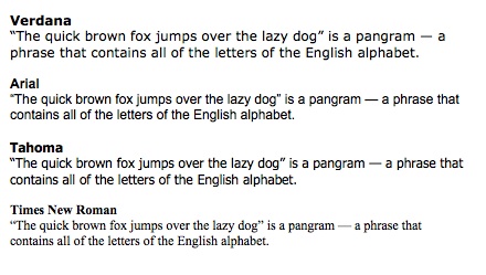
We had a Twitter conversation about this. Times New Roman got a definite thumbs-down and Arial more nays than yays, while views on Verdana were about equally balanced. Tahoma also got a good review. Here’s a comparison (all 12-point):

Verdana, Arial, Tahoma and Times New Roman - fonts compared

A proofreading tip

Karen Tkaczyk (aka @ChemXlator) offered a useful tip: if you change the font for proofreading, you’ll pick up different aspects of your text that you wouldn’t otherwise have noticed. She says it works both on-screen and, her preferred method, on paper.

My own proofreading method is to print out the text and read it on paper, but for times when you don’t have access to a printer changing the font sounds like a good idea. And I’ll definitely try changing the font next time I proofread on paper.

Gillian Hargreaves (@ghargreaves) also prints out for the final check. She uses a CAT tool (memoQ, default font Tahoma) on-screen and prints out in the source text font – so again, a change of font for the final read-through.

What about you? What are your favourite/least favourite fonts for on-screen work? Or do you have any proofreading tips to share?

Other posts you might like:

Cut printing costs: use Century Gothic

Nouning and verbing: an ask too far? 

Smart quote-marks for smart translating

By Marian Dougan


Happy burger day!

Vintage Metal Sign - Try Our Homestyle Hamburgers

Today is apparently National Burger Day. For those of us more interested in words than in food (who am I kidding?), here’s the etymology of burger (and of hamburger), courtesy of the Online Etymology Dictionary.

burger (n.)

1939, American English, shortened from hamburger (q.v.).

hamburger (n.)

1610s, “native of Hamburg;” the meat product so called from 1884, hamburg steak, named for the German city of Hamburg, though no certain connection has ever been put forth, and there may not be one unless it be that Hamburg was a major port of departure for German immigrants to United States. Meaning “a sandwich consisting of a bun and a patty of grilled hamburger meat” attested by 1912. Shortened form burger attested from 1939; beefburger was attempted 1940, in an attempt to make the main ingredient more explicit, after the –burger had taken on a life of its own as a suffix (cf. cheeseburger, first attested 1938).

Check out the price in the illustration, by the way: 25 cents?!?

Buon appetito!

Other posts you might like:

If the shoe doesn’t fit: getting the etymology right

English-Italian blues

Carobs are a girl’s best friend

By Marian Dougan

Language learning in decline? Spread the language love!

Gary Muddyman of Conversis has written an interesting blog post – Is Britain becoming a nation of monoglots? – on the decline in language learning in UK schools. The post includes links for further reading (and viewing) on this worrying subject.

Is there anything we, as people who love language and languages, can do to encourage language learning and lend some much-needed support to modern language departments in schools and universities?

I’ll be speaking about educational outreach, and suggesting ways for translators and linguists to encourage young people to continue their language studies, at Cracow Translation Days in early September. Check out the programme – if you haven’t booked yet, you might still be able to grab a cheap flight!

Other posts you might like:

Language learning matters. Word of the British Chambers of Commerce.

Spreading the language love (3) by Tess Whitty.

Teaching the language love.

By Marian Dougan