Get off your butt

I’ve just read a pretty scary article in The Independent newspaper which says that people who spend many hours of the day seated (at their desks or on the couch watching TV) are increasing their risks of ill health (and early death) — regardless of exercise at other times. This quote sums it up:

The most recent research[…] analysed survey responses from 123,000 people with no history of cancer, heart disease, stroke or lung disease. […] Researchers found that women who reported more than six hours per day of sitting were 37 per cent more likely to die during the period than those who sat fewer than three hours a day, while men were 18 per cent more likely to die. It didn’t matter how much physical activity the subjects took at other times.Which means, quite simply, that you can be lean and fit and still increase your chances of an early death from all causes by sitting down too much.

So all those power-walks and gym classes aren’t helping, if you spend the time in between totally sedentary (guess who’s guilty of that).

One way to prevent (or at least lessen) the risks is to incorporate movement — standing, walking, stretching, muscle-flexing — into your daily routine. The article gives the following tips for sitting less:

  • Deliver messages to colleagues personally rather than by email.
  • Use your lunch break. Walk around town rather than munching a sandwich at your desk.
  • Conduct meetings and make calls standing up.
  • Buy a height-adjustable desk and combine periods of sitting and standing.
  • Stand up and stretch or walk around for 60 seconds every 15 minutes or so.
  • If you can, organise your workspace for “planned inconvenience”, which is popular with office interior designers in the US. Printers, water coolers, storerooms etc, are placed away from desks, making staff walk.

These clearly aren’t all feasible for people working from home or in small offices. But we can all make small changes — moving the printer further away, say (or even just making an effort to stand up to reach the controls, rather than just stretching over). The tip about making phone calls standing up is a good one — marketing and sales experts recommend doing so in any case for work calls, as you’ll sound more business-like that way. Another idea might be to stand up whenever you spend time on Twitter (but watch your posture and your back — don’t hunch your shoulders).

My post from last July on Keeping Healthy at your Desk includes some muscle-flexing exercises that you could also incorporate.

By Marian Dougan

Converting PDFs (for free) without losing the formatting — or your temper.

I  took part in a conversation on Twitter recently about converting files from PDF to Word without losing the formatting. In this case, it was for translation purposes but there are plenty of other circumstances where this would come in handy. Filling in forms sent as PDFs, for example (so without having to print them out and fill them in by hand).

I use Nitro Software’s PDF to Word web-based application for this. It’s free, works well and is a real time-saver.

The application is easy to use. From the PDF-to-Word website you just choose and upload the file you want to convert, select whether you want it in RTF or DOC format and type in your email address. Once the conversion’s been done, you’ll get an email with your Word file — complete with tables, charts and graphics.

Here are a couple of screenshots of the Word version of a PDF I converted recently:

Screenshot of Piano Giovani – PDF to Word (1)

Screenshot of Piano Giovani – PDF to Word (1)

You might need to tweak the document a wee bit but in my experience most of the formatting is preserved. In the example above all the text in the table is editable but that in the pie chart, and in the logos obviously, is not.

You may also have problems with speed once you start working on the file if the document is very complex and image-rich. But that’s not the fault of the file conversion (it helps if you don’t have a million browser windows open plus TweetDeck running in the background. Not that I’d ever be guilty of that). PDF to Word doesn’t work with all files — locked ones, for example.

I’m sure there are other good PDF conversion applications available — any recommendations?

By Marian Dougan

Dot-dot-dot (2): when to type an ellipsis

My post on Tuesday (26 October) was about how to type an ellipsis; this one goes into a wee bit more detail about when you should do so. I’ve lifted the following straight from Wikipedia, mainly to save time but also because I love the following phrase: “the ellipsis can also inspire a feeling of melancholy longing”. Sigh….

Ellipsis (plural ellipses; from the Greek: ἔλλειψις, élleipsis, “omission”) is a mark or series of marks that usually indicate an intentional omission of a word in the original text. An ellipsis can also be used to indicate a pause in speech, an unfinished thought, or, at the end of a sentence, a trailing off into silence (aposiopesis) (apostrophe and ellipsis mixed). When placed at the end of a sentence, the ellipsis can also inspire a feeling of melancholy longing.

The ellipsis calls for a slight pause in speech. The most common form of an ellipsis is a row of three periods or full stops (…) or pre-composed triple-dot glyph (…). The usage of the em dash (—) can overlap the usage of the ellipsis. The triple-dot punctuation mark is also called a suspension point, points of ellipsis, periods of ellipsis, or colloquially, dot-dot-dot.

If you’ve got time, check out Wikipedia’s ellipsis page — it’s packed with information. Including the use of the ellipsis in other languages, in Maths and in programming. The right-hand sidebar has a really tempting list of other punctuation links but DO NOT GO THERE if you want to get any work done for the rest of the day.

By Marian Dougan

Dot-dot-dot (1): how to type an ellipsis

Here’s a quick tip  that comes in handy for computer-typing in general and Twitter in particular (it saves you two characters).

When you’re typing an ellipsis (three dots indicating an omission), instead of typing all three dots, type it as a single character by using the following keyboard shortcuts:

Mac OS ellipsis: OPTION + semicolon

Windows ellipsis: ALT + 0133

Note: your Mac keyboard might say “alt” instead of “option” (mine does).

Here’s a 3-dot ellipsis: … and here’s a single-character one: … (they should look slightly different – do they?).

Apple provides a list of keyboard shortcuts here. It doesn’t include this one, which I discovered from The Non-Designer’s Type Book, by Robin Williams. Who now contributes to the Peachpit Commons Blog (yay!), with John Tollett (their blog is Design Think). According to Robin, the single-character ellipsis is not ideal in typographical terms — the dots are too tightly spaced.

Matthew Butterick also discusses ellipses on his Typography for Lawyers site (featured in Sunday’s post on Internet Gems). Check out the comments too — it’s amazing the amount of discussion three wee dots can trigger.

If you end a sentence with an ellipsis remember to add a full stop (period) as well.

By Marian Dougan

Internet gems

One of the things I love about the Internet is the way it lets people share their enthusiasm for and knowledge of their own niche subjects. Subjects that you may never have given a second (or even a first) thought to but when you discover them are a delight.
Here are some examples:

The Daily Drop Cap: an ongoing project by typographer and illustrator Jessica Hische.

Each day (or at least each WORK day), a new hand-crafted decorative initial cap (see example above) for your enjoyment and for the beautification of blog posts everywhere”.

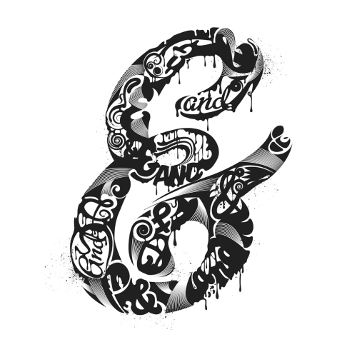
Three-hundred and sixty five ampersands: a blog celebrating the beauty of the ampersand, one is posted each day.

Two Nerdy History Girls. By Loretta Chase (writes historical romance) and Susan Holloway Scott (historical novels). Their blog is about:

the everyday details of life. We talk about who’s wearing what and who’s sleeping with whom. We try to sort out rumor or myth from fact. We thought there must be at least three other people out there who think history’s fascinating and fun, too. This blog is for them”.

Typography for Lawyers. This to me was perhaps the most surprising find of all. Lawyers and Typography? Not two words I’d have expected to see in the same sentence, far less in a dedicated website. Just goes to show how unimaginative I am. The site was created by Matthew Butterick, an attorney in Los Angeles whose CV also includes an art degree, digital font design and website development. Here are his thoughts on typography in the legal profession:

Even though the legal profession depends heavily on writing, legal typography is often poor. Some blame lies with the strict typographic constraints that control certain legal documents […]. But the rest of the blame lies with lawyers. […] I assume this is for lack of information, not lack of will.[…] There are numerous guides on typography for generalists but none specifically aimed at lawyers. So as one of the few typographers-turned-attorneys in America (yes, there are others), I figure that if I don’t do it, nobody will”.

I was amazed to discover from Matthew’s website that the US states all have their own typography and layout rules, and that within each state the rules may vary from one type of court (Appellate, Civil, Circuit, Federal etc) to another. How complicated is that?!

Etegami Notebook. A blog by Deborah Davidson, an Etegami artist and fellow translator (Japanese to English), who describes Etegami thus:

Etegami (e= “picture”; tegami= “letter/message”) are simple drawings accompanied by a few apt words, and they are usually done on postcards so that they can be easily mailed off to one’s friends. Though etegami has few hard-and-fast rules, traditional tools and materials include writing brushes, sumi ink for the outline, gansai blocks for color, and soft absorbent washi postcards. They often depict some ordinary item from everyday life, especially items that bring a particular season to mind”.

Deborah’s drawings are so lovely and so diverse. They really do show the beauty in everyday things.

Floating Along in the World of Japanese Prints. Another Japan-related blog, this time by Gina Collia-Suzuki. Gina describes herself as a “Frightfully serious art historian & incredibly silly novelist”. This excerpt from her LinkedIn page maybe explains the sort of enthusiasm/passion for a subject that inspires people to devote so much time to creating such marvellous, inspirational blogs and websites for us all to enjoy:

To say that I am obsessed with Japanese prints would be a great understatement. I live, eat and breathe them. This passionate love affair all began back in 1986, when I was a student. I went on a field trip with a group of fellow students, to Birmingham Museum & Art Gallery, and saw a Japanese woodblock print for the first time. It was one of Utamaro’s, and it was love at first sight. I immediately bought a copy of Jack Hillier’s Utamaro: Colour Prints & Paintings, and carried it with me everywhere I went from that day forward”.

Gina looks about 18 but attended art school in the 1980s. So she must be a wee bit older than that. More evidence that enthusiasm keeps you young!

I hope you enjoy these sites. If you have any favourites of your own – or if you’ve created your own site or blog dedicated to a subject that you love – share them in the comments!

By Marian Dougan

A translation sin of omission

Ampersand graphicI wrote a couple of posts, back in August, about the Oxford comma (Oxford commas (1), The Oxford Comma dilemma: a solution? and Oxford commas (2): Live dangerously – take our poll!).

This post too is about “list” sentences containing commas. It’s also about a way of spotting when an Italian-to-English translator is working on automatic pilot (not a good work mode!).

In sentences containing lists of items separated by commas, many Italian writers omit the “e” (and) before the last item. Translators working on autopilot often simply tranpose the sentence structure and omit the “and” in their English translation. In my book this is a translation sin – venial, perhaps, and of omission rather than commission, but a sin nonetheless.

It’s a mistake because it confounds readers’ expectations. Anything that puzzles the reader of the translated text, or brings them up short – even for just a second, even if they can’t put their finger on just what the problem is – interferes with their smooth reading and understanding of the text. That makes for bad translating.

In this case, English-speaking users reading a “list” sentence expect to see the word “and” before the last item. It acts as a signal that the list, and the sentence, are about to end. So if the sentence comes to a full stop without that “and”, they’re a wee bit taken aback.

Of course, this rule, like others, can be broken to good effect. But to break a rule well, you need to understand it in the first place. In English, you can omit that “and” if you want to imply that the list is not complete and could go on. For example.

Italian:

“la natura della minaccia è […] rappresentata da una rete di fattori di instabilità potenzialmente interconnessi: terrorismo, narcotraffico, tratta di persone, criminalità organizzata, proliferazione nucleare”.

English:

“The threat […] consists of a network of potentially interconnected factors of instability: terrorism, drug trafficking, people trafficking, organised crime, nuclear proliferation”.

The implication here is that humanity faces other threats too, but those mentioned are quite enough to be going on with, thank you.

So yes, you can break the “and” rule, if you know what you’re doing and why you’re doing it. But not just because you’re working on automatic pilot.

Question for Italian readers: is there a grammar or style rule in Italian governing the use (or non-use) of “e” before the last item of a list? Comments and explanations very welcome!

Ampersand graphic courtesy of Steven Bonner, whose work recently appeared in Ben Zimmer’s On Language column in the New York Times – so I’m very chuffed that he’s letting me use one of his designs too!

By Marian Dougan

Planked away

My mother, who’s 85, was discharged from hospital last week. Her local pharmacy makes up a weekly blister pack dividing out her medication for each day. Yesterday, she got a bit confused and took her pills at the wrong time. My sister Eileen decided to hide the medicines away until Mum can manage better for herself.

Eileen sent me an email this morning saying that she’d phoned IRIS (the rehabilitation and after-care team) to fill them in on “the medicine plank”, in case Mum’s carers couldn’t find the pack and there was a panic.

“Plank”, as used here, is Scots for “hiding-place”. It can also be used as a transitive verb – to plank something away (as we Scots often do with our purse or wallet when we go out for a drink with friends in case, horror of horrors, one of them asks us to pay for a round).

You can find more Scots words on our “Your words” page – feel free to add your own favourites (or pet hates) in the comments. In other languages too – English included.

By Marian Dougan

The shaky maths of child benefit cuts

I’ve written in previous posts (Teaching the language love, Sharing the language love (1) and Sharing the language love (2) – Careers Days) about language learning, which I believe is a vital part of any school curriculum (primary or secondary level).

I also believe that maths and the sciences – and any other subject that captures young people’s interest and helps them develop as human beings and find fulfilling employment – should be promoted and encouraged.

I’m now thinking, however, that here in the UK we should be placing a special emphasis on maths. Especially for those poor kids attending “public” schools, who – judging from the performance of the adult generation now in government – seem to be falling seriously short in basic numeracy skills.

Our new government intends to eliminate child benefit for any household where one parent earns more than £44,000, with effect from 2013. (For the sake of argument, I’m interpreting a household as a married couple (still living together), with children). So, under the government’s (what I hope are still reversible) proposals, we’d have a situation where:

  • A household with two working parents each earning £22,000 (total £44,000) would continue to receive child benefit.
  • A household with two working parents each earning £43,900 (total £87,800) would continue to receive child benefit.
  • A household with one non-working parent and one working parent earning £44,000 would not receive child benefit.

Child benefit, I believe, goes directly to the mother. Some households have violent or abusive fathers who withhold money from their wives, and consequently from their children. Some of these violent and abusive fathers are in the high-earning bracket. I realise that many violent, abusive fathers are themselves victims. They need help. But in the meantime, so do their wives and children.

For these families, child benefit is a small, fragile but vital lifeline for both mothers and children. It’s intended to protect potentially vulnerable members of society and embodies a universal welfare principle that Britain should treasure and be proud of.

I don’t think the new government’s maths adds up. I see an easy target, and a large dose of ideology. But sound maths? I don’t think so.

By Marian Dougan

And sometimes words are just soooo interesting!

I’ve just been reading Khoi Vinh’s marvellous blog, Subtraction. In his post on “Ways I’m a Dork: Travel Edition” he describes the Grid-It Organizer from Cocoon. The Grid-It holds “all the paraphernalia — cables, remotes, pens, dongles, adapters, etc.” that most of us now need to pack for work trips (and probably holidays too).

The word paraphernalia caught my eye – it’s a great word, I think, and in Khoi Vinh’s post such a delicious contrast with the short, concrete words (cables, remotes, pens etc.) that followed it. I used to know but had forgotten its etymology, so I looked it up.

Here’s the definition from Merriam-Webster:

Definition of PARAPHERNALIA

First Known Use: 1651
1: the separate real or personal property of a married woman that she can dispose of by will and sometimes according to common law during her life
2: personal belongings
3 a: articles of equipment : furnishings
b: accessory items : appurtenances
Origin of PARAPHERNALIA
Medieval Latin, ultimately from Greek parapherna bride’s property beyond her dowry, from para– + phernē dowry, from pherein to bear
First Known Use: 1651

And here’s the one from the Online Etymology Dictionary:

1650s, “a woman’s property besides her dowry,” from M.L. paraphernalia (short for paraphernalia bona “paraphernal goods”), neut. pl. of paraphernalis (adj.), from L.L. parapherna “a woman’s property besides her dowry,” from Gk. parapherna, neut. pl., from para– “beside” + pherne “dowry,” related to pherein “to carry” (see infer). Meaning “equipment, apparatus” is first attested 1791, from notion of odds and ends.

Fascinating, and thought-provoking.

By Marian Dougan

Sometimes you just don’t need words…

…even words to good effect.

With thanks to Bird Box Studio and Rough Cut.

By Marian Dougan